Final Design
Design Challenge
Problem
Online dating, as part of the attention economy, seems to purposefully restrict information so that users are more incentivized to engage.
Solution
An informational poster showcasing key facts users should know about online dating, and promoting a culture where discussing online dating is not taboo.
Project Overview
Brief
Create an information poster about any topic of interest.
Stakeholders: Maxim Safioulline (Information Design Professor)
My Role
Sole designer and researcher.
Client
SMC | Information Design Class
Inspiration
Goals
Studying information posters that are both beautiful and complex at once.
I noticed these patterns in my favorite posters:
I noticed these patterns in my favorite posters:
Storytelling and negative space.
I appreciate the way this designer utilized the negative space of this poster, and created an instantly-graspable experience.
I am inspired by the levels of dimension — how I can compare the area of each circle to have an understanding of each country’s population and GDP — and reconcile that with the country’s political freedom — especially interesting when comparing China to India, for example. Though this poster presents a variety of critical information all at once, I find it quite beautiful.
I am inspired by the levels of dimension — how I can compare the area of each circle to have an understanding of each country’s population and GDP — and reconcile that with the country’s political freedom — especially interesting when comparing China to India, for example. Though this poster presents a variety of critical information all at once, I find it quite beautiful.
Countries with better human development show less corruption and more political freedom
By Raphael Halloran
Building interest, and showing outliers.
I’m fascinated to see how the designer describes Ross’s content, and thus paints a picture of what humans find relaxing. The designer calls out outliers, and presents the insight that humans find landscapes dopamine-inducing, and cortisol-reducing.
As we’ve learned that humans respond to other humans, (like the whites in the eyes, etc.) the claim in this poster is quite interesting, and provides a beautiful start to a rabbit hole for viewers, about the science of these relaxing artistic choices. Was it about the painting, or more about Ross’s presentation, that kept viewers coming back?
As we’ve learned that humans respond to other humans, (like the whites in the eyes, etc.) the claim in this poster is quite interesting, and provides a beautiful start to a rabbit hole for viewers, about the science of these relaxing artistic choices. Was it about the painting, or more about Ross’s presentation, that kept viewers coming back?
Charted Lexicon – Bob Ross
By Francesca Morini and Rahul Raho
Prioritizing subtlety, despite information density.
I find this poster to be a beautiful example of how to simplify a concept, to avoid overwhelming a viewer, while still providing interesting and worthwhile data. Though in our class we discussed how a legend can be a cop-out, as giving instructions as to how to read a poster can mean the design solution is lacking, I find this poster’s use of that technique effective and useful, for limiting the cognitive load of viewers. At a glance I understand that the US average life evaluation, for example, is fairly high, though our GDP is higher.
I wonder if the designer could have included a comparison to a country like Finland, as here it seems that the US has the highest average life evaluation? But this poster helps me make instant connections, like why has Pakistan’s evaluation dropped so far in the past few years?
I wonder if the designer could have included a comparison to a country like Finland, as here it seems that the US has the highest average life evaluation? But this poster helps me make instant connections, like why has Pakistan’s evaluation dropped so far in the past few years?
Can money buy happiness?
By Manvi Mehrotra
Research
Process
Documenting all publicly available (for free) data, to discover patterns and find stories to tell.
Excerpt from my "Changes in Romance Over Time" Spreadsheet.
Key Insights
30% of US adults have ever used dating apps, 2023.
Tinder tops list for all-time use.
1-in-10 partnered adults met their significant other through a dating app.
1-in-10 partnered adults met their significant other through a dating app.
(Pew Online Dating (2005, 2013, 2016, 2019, 2023).
People self-select the wrong photos.
(Photofeeler).
Quarter of Americans aren't looking for a relationship, 2023.
Nearly 47% of the US population is single.
There's a link between dating apps and experiencing loneliness, and a feeling of exclusion from the world.
(Forbes).
(Forbes).
The median number of likes per day is ~0 for men, and ~6 for women.
(Simulation by Memeable Data on YouTube).
Specific times of day on Bumble are more effective.
(Bumble data).
41% of Gen Z are open to or seeking non-monogamy.
55% of dating app users have been in a serious relationship with someone they met on Tinder — 40% of Tinder members using Relationship Goals are looking for a long term relationship.
(Tinder data).
Men match with 2.5% of right swipes, women match with 33%.
Women swipe right ~7% of the time, men swipe right ~40%.
(Tinder Insights — gathered from volunteering Tinder users).
(Tinder Insights — gathered from volunteering Tinder users).
People have 2x the chance of going on a second date if the first date focuses on convo, over physical intimacy.
Gen Z are 30% more likely to believe in soulmates, than millennials.
33% more likely than millennials to say they feel more comfy chatting with partner online than IRL.
33% more likely than millennials to say they feel more comfy chatting with partner online than IRL.
(Hinge data).
Stories to Tell
Continuity and change over time
Three-in-ten U.S. adults say they have ever used a dating site or app, identical to the share who said this in 2019.
Effects on gaps in gender
In the world, women are leaning more progressive, men are leaning more traditional.
Youth perspective on dating, versus parents.
Negativity about dating — is it widespread? What contributes?
Fact that people don’t choose their best photos…
Data Visualization
Process
To identify these stories and get feedback from my professor, I started with preliminary Data Viz sketches.
With no prior experience in Data Viz, I used Figma for these.
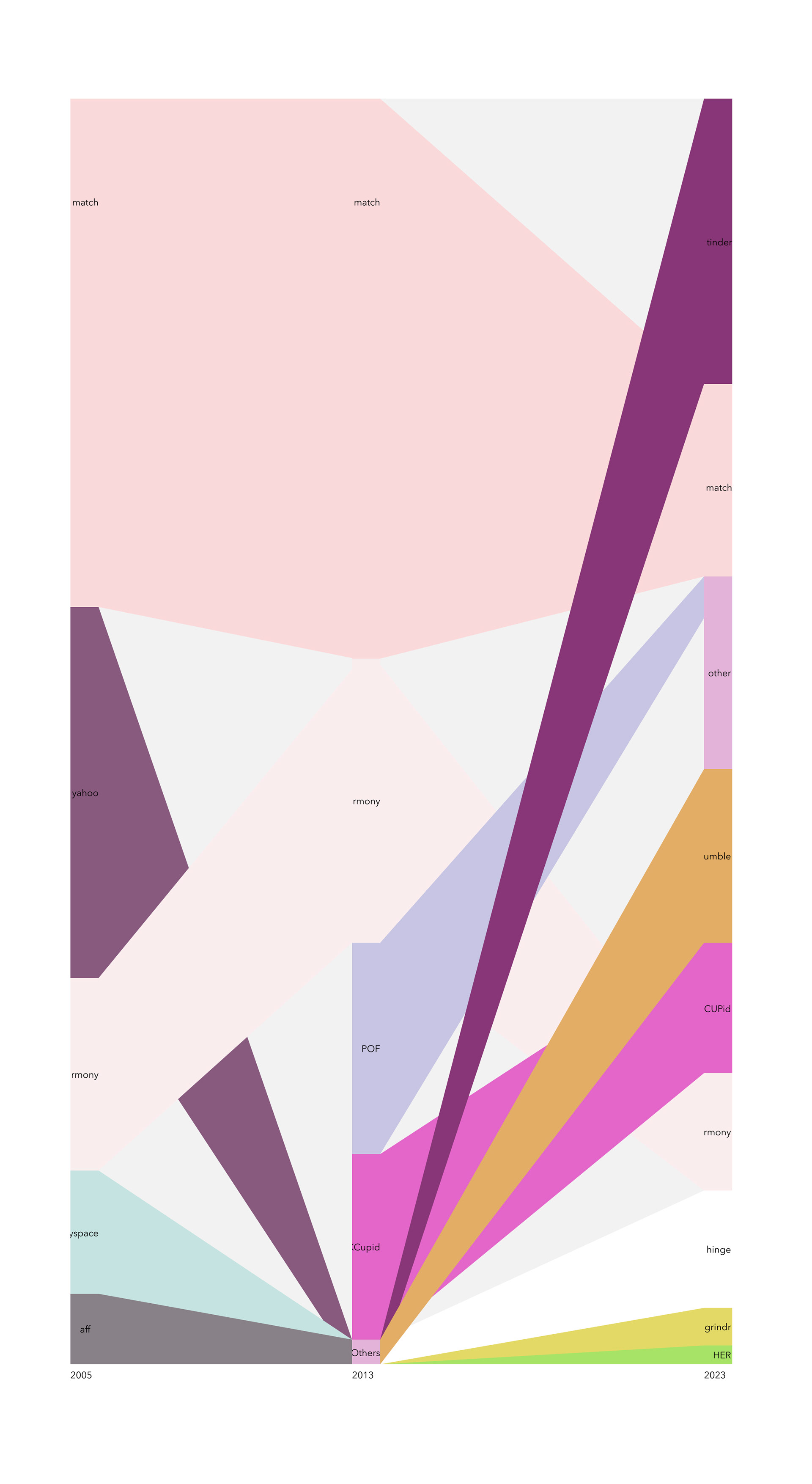
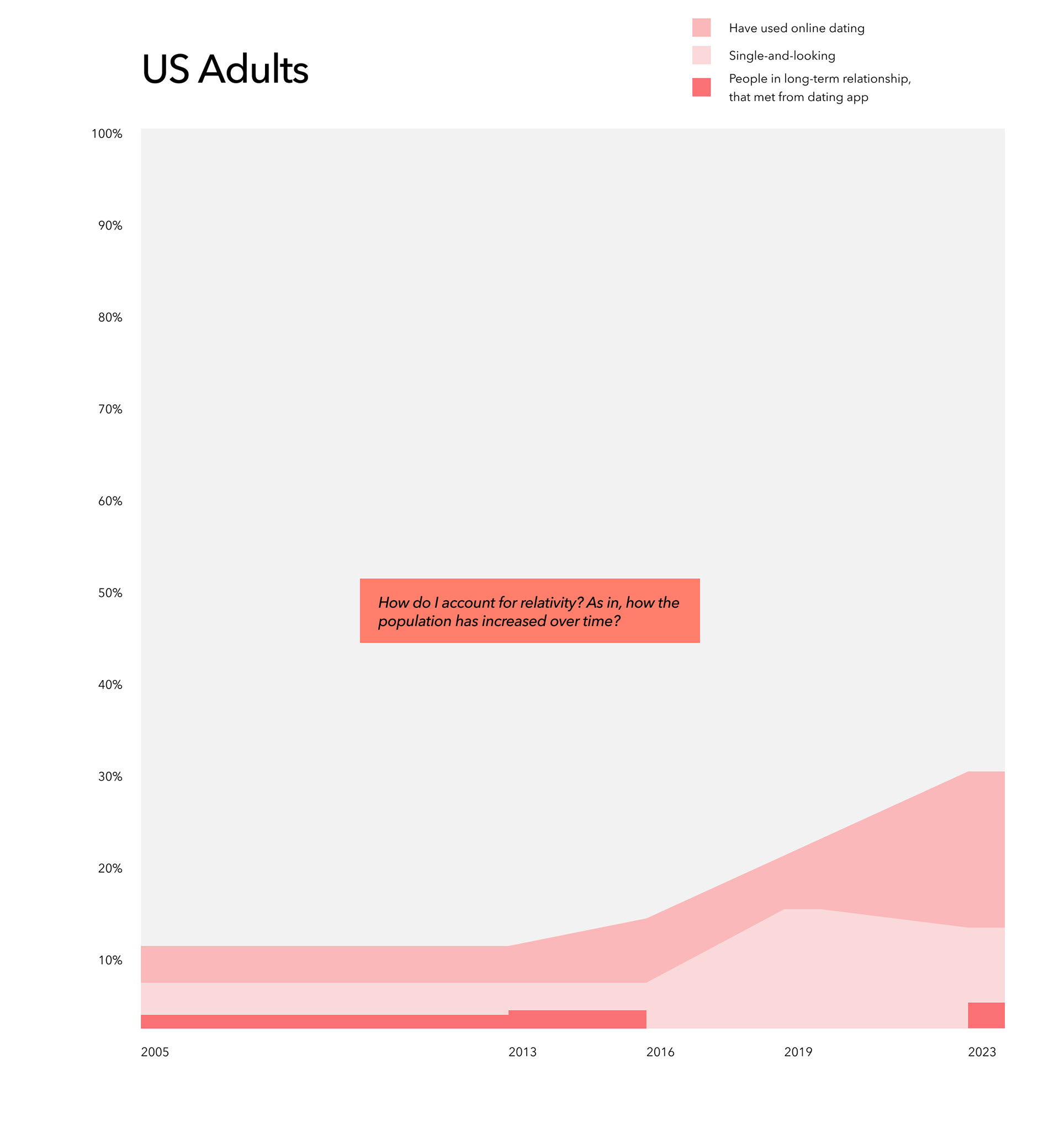
Changes in User Bases.
Tinder is now the most popular, though it started later than Match. Are more people looking for short-term relationships?
Changes in Dating App Use.
The number of online dating users has grown, and the number of people who are single and looking, or finding relationships from these apps, has been capping off at a certain point.
Does this suggest that those who are not currently single, might have found their partners through these platforms?
Layout
Goals
Create an insightful narrative to take people through the information.

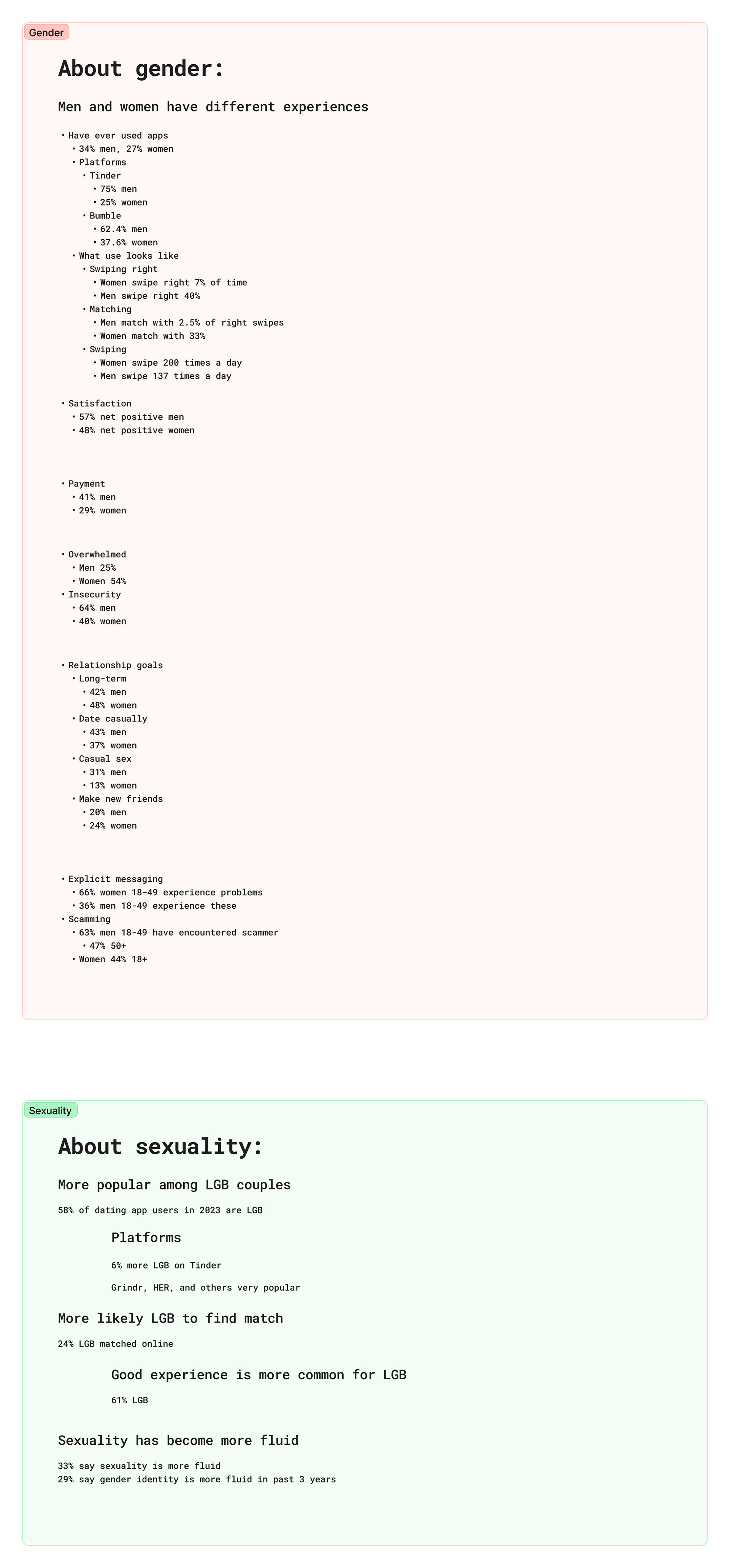
Start with tips for using the apps.
Help users find their ideal user base.
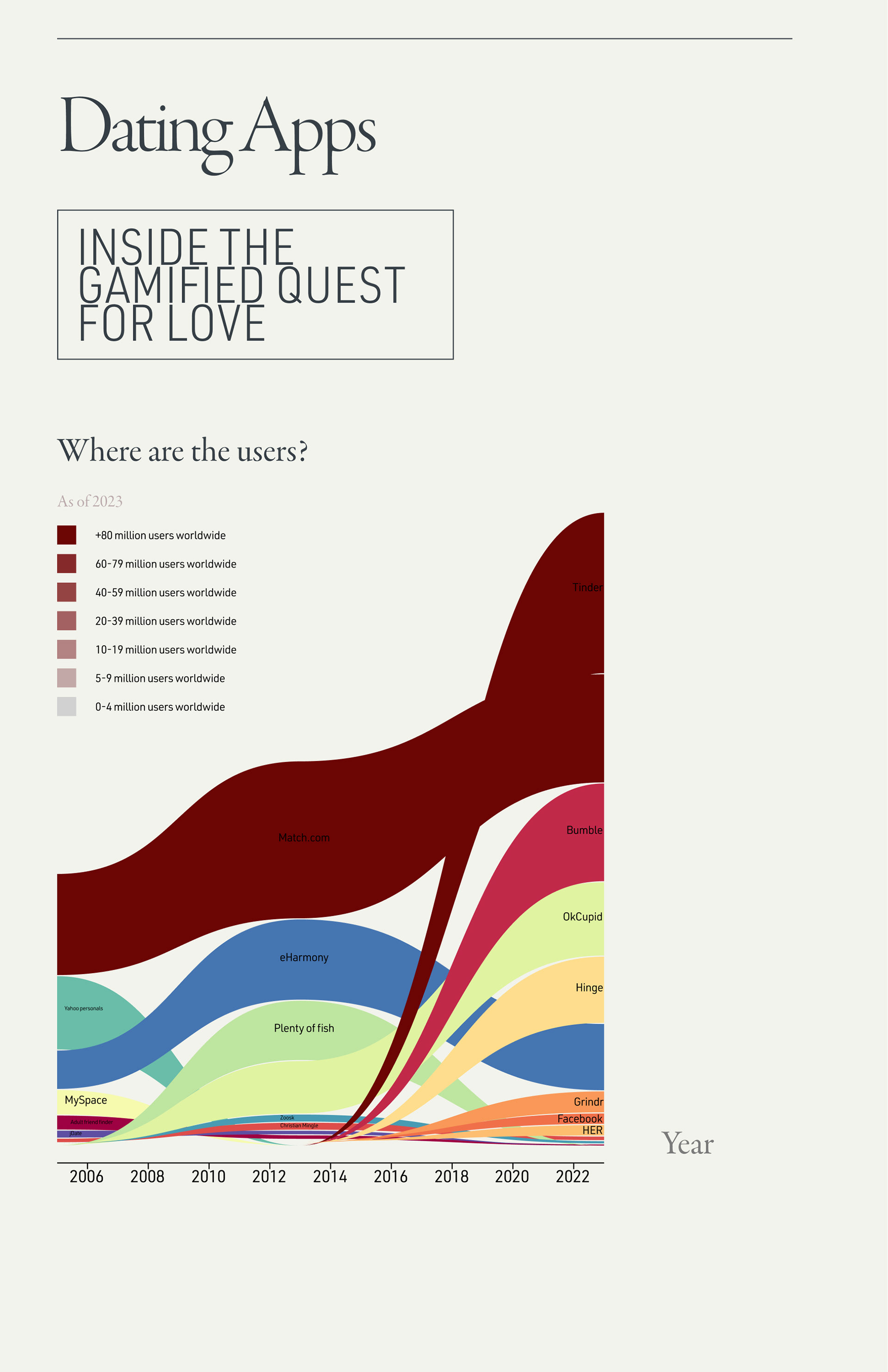
Stream graph for app usage helps to describe where the users are. Users can decide whether they want to be on the more or less saturated apps.
Describe how and why those users are on those apps.
Demographics section describes the user bases of each, and describes the portion of the population you may find on the apps.
Explore how to work with the data segmenting gender.
Perhaps users want to know how they compare to others in their gender, or the problems facing the other gender.
Explored the difference in experience for heterosexual vs LGB relationships on these apps.
Feedback
'You should trim this, unless you wanna make something that's the size of the entire wall.
You can get yourself lost in exploring it. Those infographics are always so much fun, but they take so long to make.'
My professor, Maxim, recommended that moving forward, I focus on only the essential data.
Next Steps
Taking on the challenge.
I felt that Maxim was right, and I was struggling to tell a cohesive story. However, despite the short timeframe, I was determined to meet Maxim's challenge, and find a way to tell a complete story that spoke to many user groups at once.
Design System
Goals
Reflect the juxtaposition in dating apps — the merging of human endeavors with algorithms and technology.
Typography
Pt sizes constructed according to Golden Ratio
Color
Data Visualization
Process
Attempting to learn D3.
I was determined to not be limited by visualizations I could create in Excel, so I set out to learn D3, which Maxim mentioned was the industry standard. I figured this was the perfect time to get practice with JavaScript.
Saving time with RawGraphs.
I found that the learning curve with D3 was just big enough that I was concerned I wouldn't finish the poster. So I was thrilled to find RawGraphs, where I could create customizable svgs for free, with complex data structures.
Data visualization, unedited from RawGraphs.
Iteration
Challenges
After attempting to fit this content onto one vertical poster, I realized I needed more space.
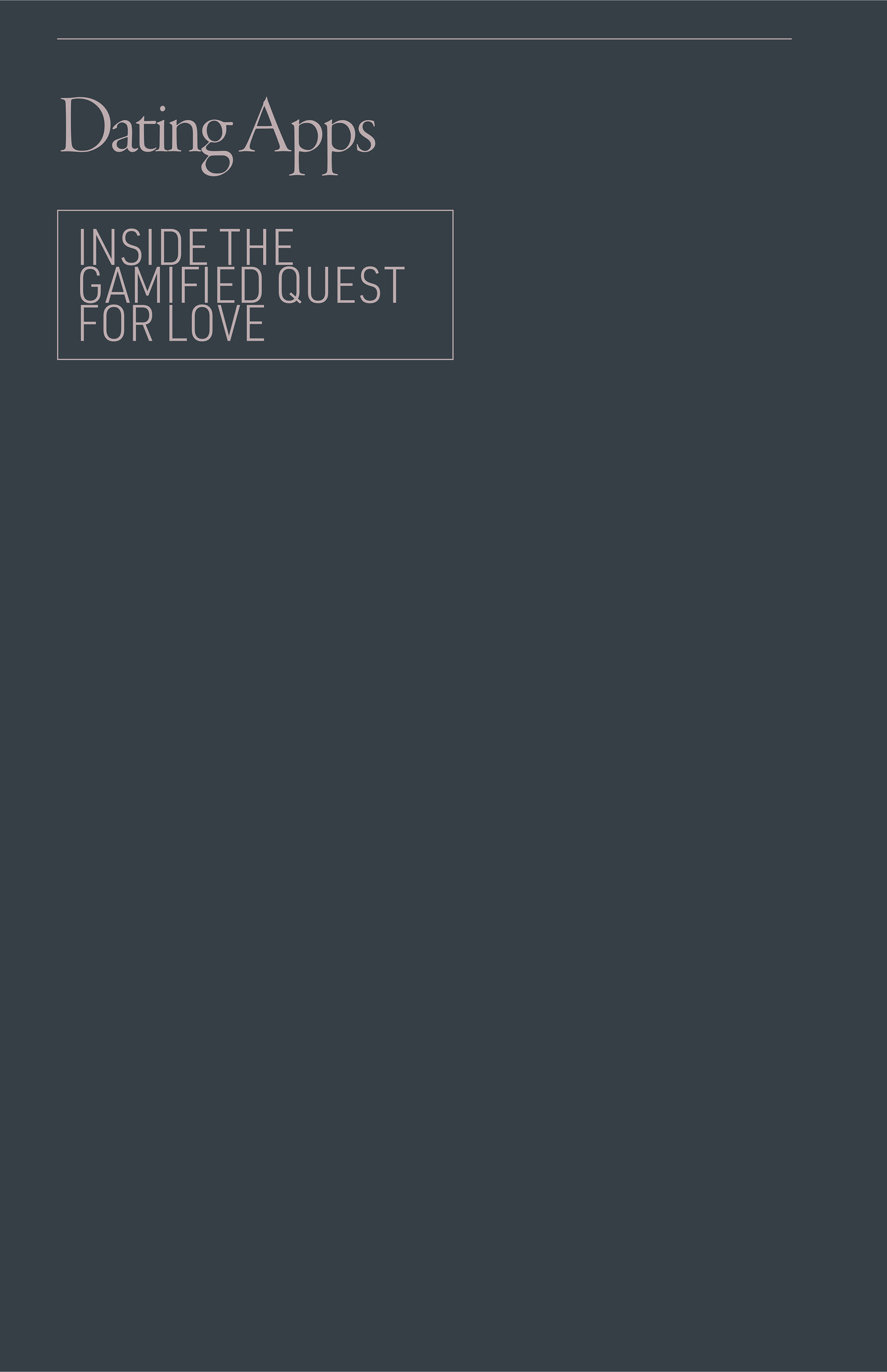
Process
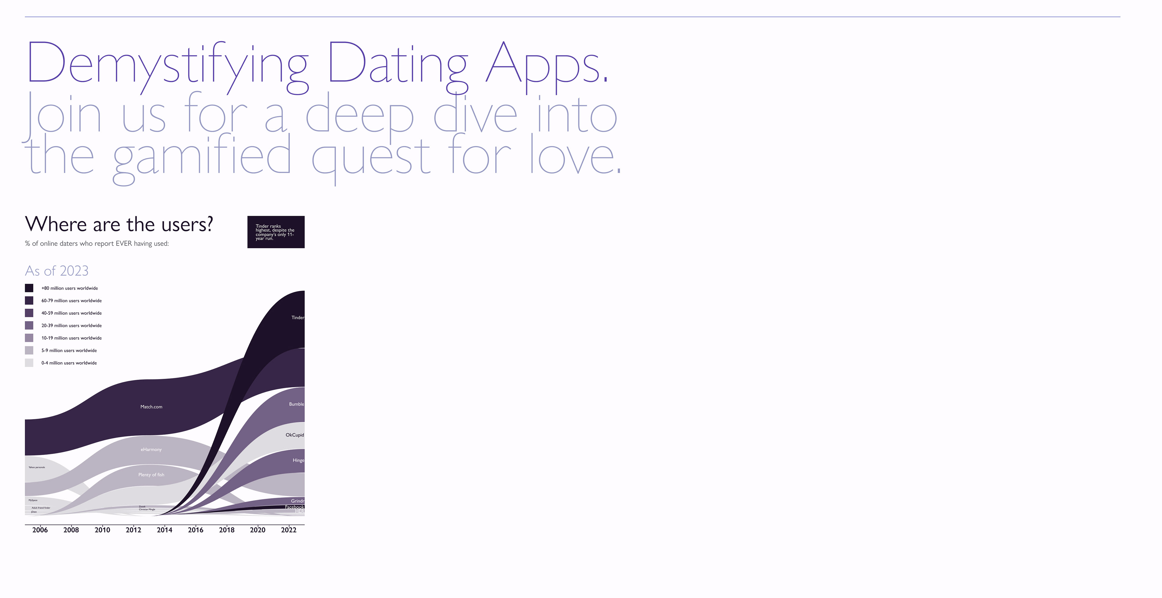
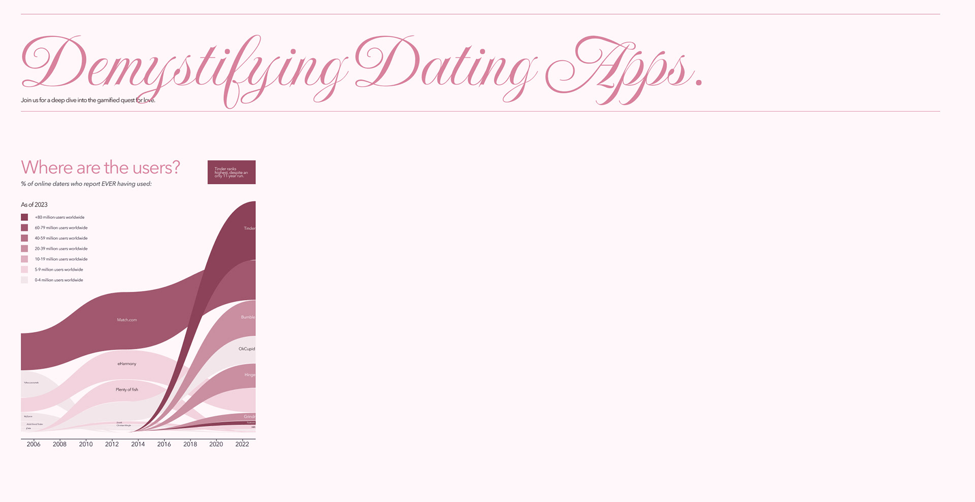
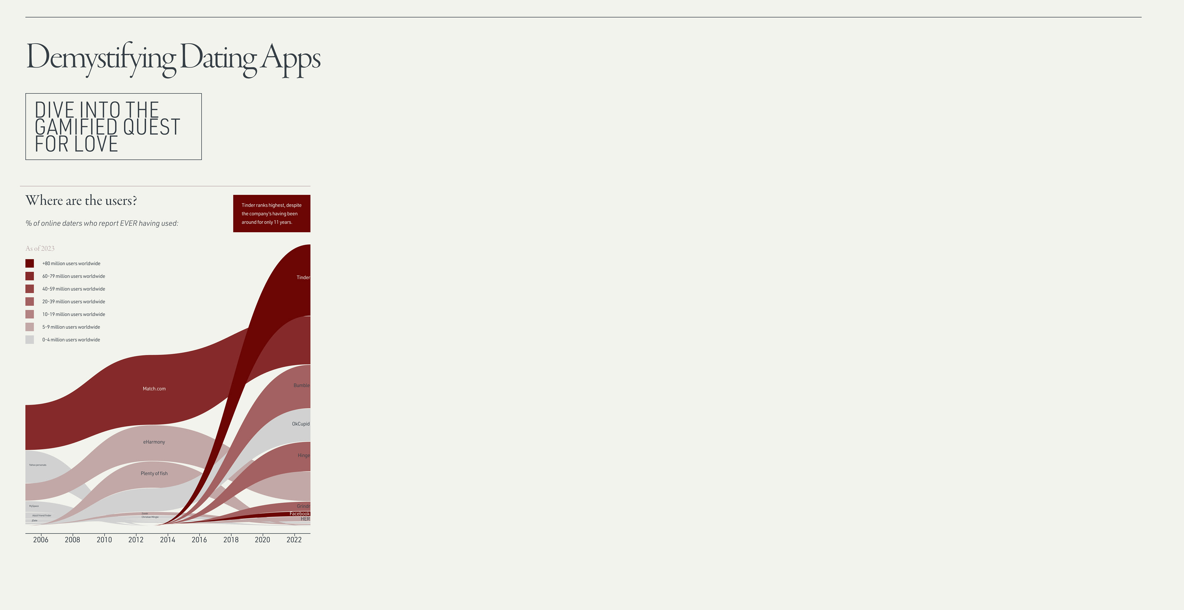
Creating 3 new style iterations. All are the combination of 3 tabloid posters, as if this was a poster series and could continue to expand.
Feedback
The graph:
'What you're what you're doing here with the colors in the key, and in the streamgraph, both represent very strong progression. So they're two stack ranks that need to be reconciled somehow. I wonder if there's a better way to outline the use of these dating apps worldwide versus in the US.
'It'd be interesting to see where the scale is.'
The layout:
SECOND DIRECTION: 'I think the second direction — the pink with the scripty title — it's a how-it-could've-been-done-but-we-definitely-shouldn't-be-doing-it-this-way kind of direction. It can be a good strategy in a deck to show a more overt and out-there idea, so we can show why our favorite concept is the most usable. So let's not move forward with the second direction.'
FIRST AND THIRD: 'The first and third look very technical, for very different reasons. The first one looks like a blueprint or a diagram for constructing a mechanism. And the third one has this Silicon Valley pitch deck type of a feel to it.
I think that the choice is yours — there are different reasons to pick one versus the other. If you're trying to highlight the fact that all of these companies are US based tech companies, like literally cornering the market on love worldwide, then it would be the third one.
I think that the choice is yours — there are different reasons to pick one versus the other. If you're trying to highlight the fact that all of these companies are US based tech companies, like literally cornering the market on love worldwide, then it would be the third one.
If you're trying to generally highlight how much technology has intervened in human affairs — I really like this juxtaposition between Garamond and DIN — I think this would be the way to go. Something like this, I could see coming out of New York Times Design Studio. This would be less about the design, and more about the data. If I was doing this, I would probably pick this option. Design takes a step back and it's almost like, very nondescript kind of black tie affair, whereas the third one is more about bringing a little bit of meaning into the component.'
Final Design
Goals
-How many people use online dating
- Which apps they're using
- How matches are distributed
- How profile critique affects those matches
- The types of relationships people want
- The number of people actually in the dating market
Process
Incorporating imagery from Midjourney.
I aimed to create an emotional connection to humanize the machinery of online dating. So I used photos of humans, and used Midjourney so they share the same pose.


Results
Feedback
'I really appreciate the story, the narrative that's unfolding here, and the complexity. You can open this up, and spend a good 20 minutes exploring it. I think that's a really, really big win.'
Next Steps
Consider spacing between elements.
Maxim mentioned it feels a bit too big — we could have more room for data or other design explorations, like creating something more interesting with the 'dive into the gamified quest for love' title.
Add scale to image graphs.
This will help to make it clear that there is a measurement for male matches — it's just quite small.
